October 31, 2010


Credit: Smile
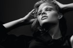
Dafne Cejas by Anthony Maule for Dazed & Confused November 2010
I terribly like high concept, somewhat unsettling editorials. They always impress me with their audacity and their dedication to a particular aesthetic. What I particularly love about this editorial is that nowhere in it does it strive to be pretty. And Dafne is unafraid of seeming off-putting or ugly even. This is a high concept piece that could have come straight out of an Alexander McQueen show. I love all the shots in black; each one is intense. Shot 4 is impressive for texture alone and that’s not to mention the way Dafne contorts herself. There is a somewhat futuristic feel with the pixelation, but there is a decidedly otherworldly tone overall. And even though she’s in all white for the last shot (featured above), I love how haunting it is. The white alludes more to death than innocence. This darker tone fits right in with the autumn season.
This slideshow requires JavaScript.
Posted in Dazed & Confused, Editorial, Fashion Industry, Magazine, Print Work |
Leave a Comment »
October 31, 2010


Credit: Fashion Gone Rogue
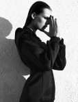
Princess Paola de Orleans by Renam Christofoletti for Vogue Brazil November 2010
Originally, I didn’t like this editorial but it grew on me. Not to mention, Paola de Orleans has some spectacular lines. Initially, this shoot seemed very androgynous themed, but then it evolved into elegant glamour. Paola de Orleans has a refined sense of grace, which is demonstrated throughout but truly noticeable in the last couple of shots. But seriously, I know models are supposed to be tall, but Paola has one of the most elongated lines that I have ever seen. It makes for some lovely shadows and she utilizes her line to its fullest, giving her a remarkable presence in every shot. I also like the range that she demonstrates; the initial images give an androgynous look with a younger feel before shifting to a decidedly womanly chic and finally ending with high glamour. The last 3 shots really hit my high fashion sweet spot; they feel the most haute couture to me. Everything just comes together nicely in those shots. That is not to say the rest is not good. They just didn’t incite a powerful visceral reaction from me. What I do like is the realism in it. Her moles and goosebumps are not edited out. And that is the way it should be.
This slideshow requires JavaScript.
Posted in Editorial, Fashion Industry, Print Work |
1 Comment »
October 31, 2010

Credit: Smile
Carrie Ann & Johnny George by Jason Kibbler for Dazed & Confused November 2010
Sometimes, all it takes is one shot. One shot that can capture the viewer. This shoot does that. I liked this without even needing to see the rest of the shoot (as short as it was). Futuristic negative coloring, yet classic denim styling from the seventies. The concept is intriguing; the double image creates an intensity that wouldn’t be there otherwise. Photographer Tyler Shields like to play with double images as well, but not quite like this. This is almost like a double identity with a darker personality within that comes out in the shot. Dazed & Confused is really impressing me with its art and concepts. It can take something simple has a girl in classic denim and turn it into something futuristic and unique. The point of view is refreshing.
This slideshow requires JavaScript.
Posted in Dazed & Confused, Editorial, Fashion Industry, Magazine, Print Work |
Leave a Comment »
October 29, 2010


Credit: Smile
Daniel Radcliffe by Serge Leblon for Dazed & Confused November 2010
Here’s the accompanying editorial to that intriguing Dazed & Confused cover. It has a nice blend of realism and fantastical elements. Daniel Radcliffe really intrigues me as an artist. His most obvious claim to fame is playing Harry Potter for the past decade, but his other projects are his true points of interest. That daring role in Equus which leads him revealing quite a bit and those poems under the pen name Jacob Gershon for Rubbish in 2007 are two highlights. Good friend Tom Felton also extols Radcliffe’s passion for acting and art, which makes Radcliffe a whole lot more interesting to me than a typical actor/celebrity. Elaborately painted and dressed in feathers, he cuts quite an image. I admire his willingness to push boundaries and his intensity and commitment to this shoot. The hazy light of his realistic shots cast him in an edgy, yet ethereal light. And it makes him, I might add, quite attractive. I also like the overcasting glam rock theme to this editorial. The fantastical shots make him appear like living art. It reminds me of the living statues in Fremont who follow you around, playfully mimicking your actions and casting them in temporary stone. And Dazed & Confused does what I feel that Interview has lost. It pushes boundaries with pop culture and art without seeming formulaic. I eagerly await what it will do next. In the mean time, this issue with have to suffice.
This slideshow requires JavaScript.
Posted in Celebrity, Dazed & Confused, Editorial, Fashion Industry, Magazine, Model, Print Work |
Leave a Comment »
October 29, 2010


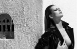
Lara Stone by Craig McDean for Interview October 2010
Lara Stone seems to be a very popular model for Interview Magazine (usually shot by Mert & Marcus). But I like this Craig McDean shoot more than any of her seductive–admittedly very kinky–editorials by Mert & Marcus. They just seem too blatant and sexually saturated. The subtly of the seduction in this impresses me a lot more than the overtly sexual clothing and busty posturing in the others. The styling may not appear seductive, by it seduces me anyway. The quality of the clothes seduce me. The isolated shape to the clothes may be unusual, but the overall shape is very womanly. And the slivers of skin peaking out between the thigh highs and skirt teases the view just enough to entice. But what I really like is the look on Lara’s face throughout the editorial. Lara has such an excellent grasp on who she is and that, to me, is extremely sexy. And the shadows in the setting really set the tone. So bravo to Lara and Craig McDean for going for something with a little more substance instead of catering to the shock and awe method.
This slideshow requires JavaScript.
Posted in Craig McDean, Editorial, Fashion Industry, Interview, Lara Stone, Magazine, Model, Photographer(s), Print Work |
Leave a Comment »
October 29, 2010

Credit: Fashion Gone Rogue
I really like seeing portrait series. It’s interesting how creative photographers can get with them when they don’t have concepts like editorials do. This black and white portrait series is gorgeous with intriguing profiles of Maria. And I must say, Maria has really impressive eyes. I like how she can draw in the viewer with them. She’s very expressive; even her blank slate shots aren’t entirely empty. That’s a good trait. I really like the side profile shot above. It’s hard to explain why but I like the wispy fly aways and how the shot isn’t centered. The messy glossy lids are nice too. It’s a good shot. And a nice little portrait series.
This slideshow requires JavaScript.
Posted in Fashion Industry, Portrait Series, Print Work |
Leave a Comment »
October 29, 2010


Credit: Fashion Gone Rogue
Abbey Lee Kershaw by Rafael Stahelin for Vogue Korea April 2010
Ok, Abbey kind of gives me the same face in every shot, but I like this editorial anyway. The outfits are wonderfully off-kilter with unusual points of interest. “Lovely Bones” is quite apt. There’s bone-like jewelry–in one case, a gigantic clasp worn as a top–and skeletal leggings with a matching long -sleeved top. That gigantic golden-ribbed bodice? is pretty awesome. I probably wouldn’t be audacious enough to wear it alone like Abbey is, but it’d contrast really nicely over a black top. Also, the headgear in this editorial is pretty awesome. The tulle–used as a veil–hardly seems bride-like and creates a queen-of-the-dead-esque image (the pearled skull helps too). I like the somewhat morbid overtones; it makes me think of Persephone as Hades’ Bride and Queen of the Underworld. I also like how there’s hardly any black in the styling, yet I get that morbid mood from I anyway. Well thought out by the stylist.
This slideshow requires JavaScript.
Posted in Abbey Lee Kershaw, Editorial, Fashion Industry, Model, Print Work |
Leave a Comment »
October 29, 2010

Credit: tfs
Abbey Lee Kershaw by Daniel Jackson for Dazed & Confused December 2009
I still can’t believe that I forgot to post two Abbey editorials from last year. This issue of Dazed & Confused was back when there was fashion obsession with Where the Wild Things Are. Abbey is adorably whimsical and disheveled in this editorial. This editorial really captures the essence of that book. The headgear is a particularly excellent touch–gotta love that fuzzy hat with the ears and lopsided crown. This editorial depicts a childish quality that easily translates into our adult lives. It may be based on a children’s book, but the styling presents whimsy without immaturity. Not to mention, I adore those Prada wide-OTK boots; aside from the horned headband, those are my favorite part of this editorial. Abbey is an excellent choice in model as she looks quite baby-faced herself in this editorial. And even though I’m posting this almost a year later, this has a very Autumn-feel to it so I feel justified in posting it anyway :P
This slideshow requires JavaScript.
Posted in Abbey Lee Kershaw, Dazed & Confused, Editorial, Fashion Industry, Magazine, Model, Print Work |
Leave a Comment »
October 29, 2010

Credit: Vogue.com
It has certainly been a while (understatement) since I’ve posted one of these. I have been so focused on editorials and shows for the blog and chemical engineering when I’m not, that these have fallen a bit behind. This was one that struck me in the midst of Fashion Month Insanity. It is being posted now as I have the time and cognitive coherence to post it.
I shop deliberately and decisively. Any puzzlement or debate does not result in a purchase. Lately, shopping has been a little less deliberate. Sometimes, just sometimes, I walk out with something impulsive and lovely: a beautiful cashmere scarf bought at sight and treasured reverently as I caress its softness or sharp black bustier with an unusual V’d back. And those may be some of the best purchases that I have ever made.
Clothes are pleasure-filled for me. I touch everything. Even before looking at price or need, I check material. Quality fabric is the building block to a quality wardrobe. One that is built over a lifetime. Clothes may just pieces of fabric sewn and manipulated into certain shapes, but they are more powerful than that. They can readily shift the psyche of a person. People frequently forget that looking good in one’s mind truly factors into feeling good. So I choose my clothes with care. An outfit that suits my mood does so much more for me than anything else.
I approach magazines in the same manner. There is no careless flipping through for me. No, no. I devour it: I scan over adds, dissect articles, peruse the editorials, and revel and dismay over chosen subjects. It may take me an hour. It may take me a day. But in the end, I inspect it cover to cover. And there had better be no torn or bent edges. It is inspected for tears or printing mistakes. Inspected for the glossiest cover and most saturated color. It may seem OCD or anal retentive of me, but this is my trade. I do not approach it lightly. It is the world which I am passionate about and fascinated by. To treat it otherwise would do it a great injustice. And cheapen the work people have put into it. Not to mention, fashion is so visually oriented. With today’s technology and obsession with HD quality, there is no reason not to expect and want the best image clarity.
However, I do not take it so seriously that I cannot have fun with it. It IS clothes after all. There’s something enthralling about immersing oneself in the world of the best photographers, greatest designers, and the most beautiful clothes. If anything, I uphold high standards. I am an elitist, I free admit. In a world of instant gratification, I await quality and applaud craftsmanship. I value creativity and appreciate thoughtfulness. Should I expect any less?
Posted in Fashion Industry, Musings, Real Life |
Leave a Comment »
October 28, 2010

Credit: Fashion Gone Rogue
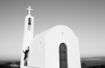
Edita Vilkeviciute by Camilla Akrans for Numéro #96 September 2008
Edita + Camilla seems to be a popular model/photographer pairing. I have counted 5 editorials with that pairing in my archives, which is quite a bit for such a transient industry. In any case, I like it. While I am not impressed by every editorial with that particular pair (it’s hard to be when they certainly do more than the 5 I have), I think they’re a very good working pair. The photography to this one, in particular, is stunning. The lighting just enhances the contrast between black and white. I love the large presence of the church in the editorial as well; it makes the wide shots really impressive. It’s great that Edita’s presence remains well felt in the wide shots as well. There’s hardly a weak shot in the lot. The shadows Edita creates are really stunning as well. I love the way she poses. Shot 3 is a particularly nice example where she’s leaning arms spread with her face upturned. But my absolutely favorite shot in this editorial is shot 5 where Edita is like a Grecian (or Italian) statue. Everything about it is just so well done, from the tilt of her head to the flowing semi-transparent sheet draped over her. I also adore Numéro for its spectacular editorials. This upholds the standard of excellence. And here’s to a beautiful partnership.

This slideshow requires JavaScript.
Posted in Camilla Akrans, Edita Vilkeviciute, Editorial, Fashion Industry, Model, Photographer(s), Print Work |
Leave a Comment »


